Interactive Element

Navigation


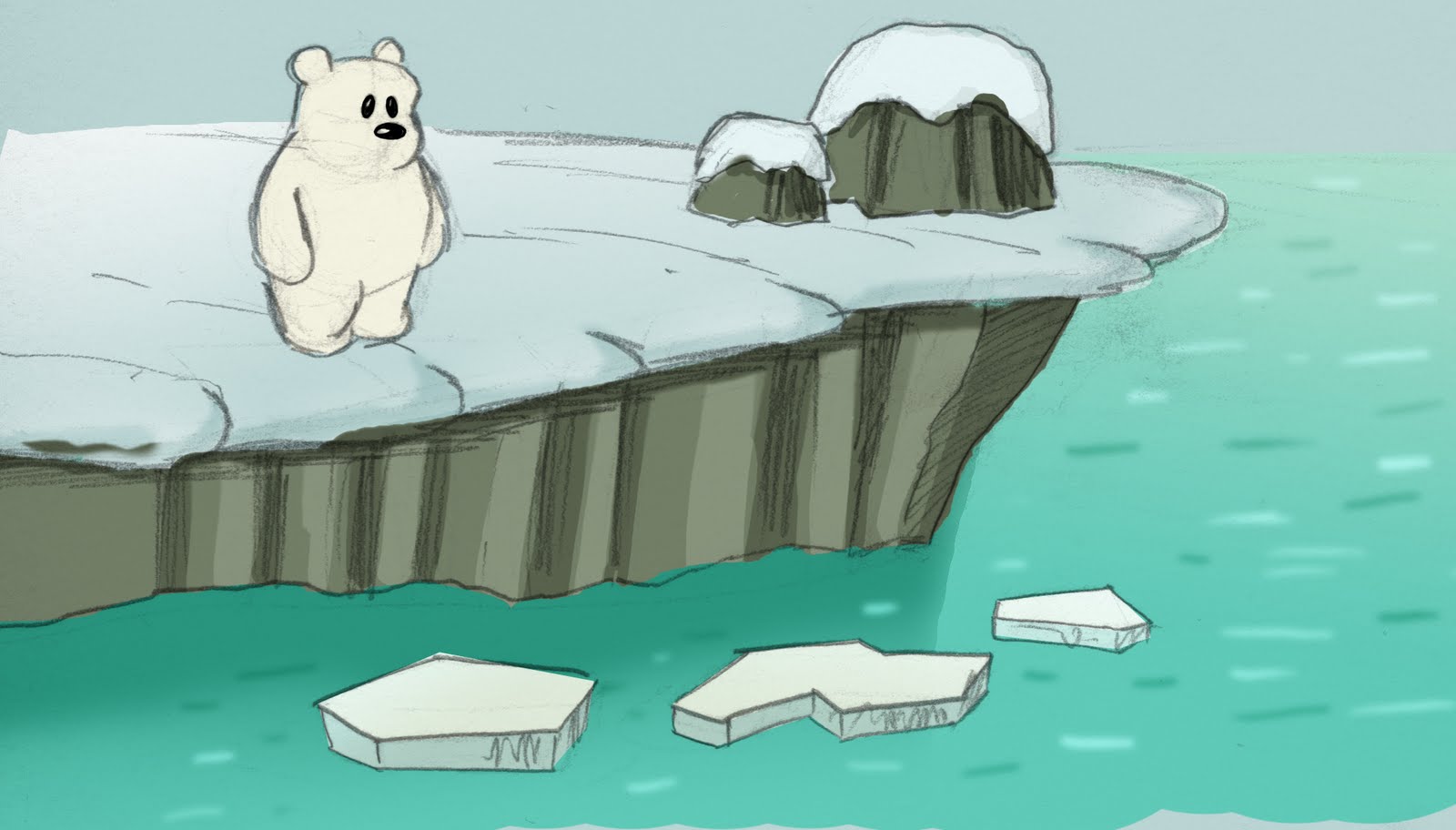
This screen will act as the main navigational hub of the story. When users rolls the cursor over different areas of the landscape, those different locations will be highlighted (see below).
When the areas are clicked the user will be taken to those locations and the story will continue.


Educational Element

Animal Facts

At certain points throughout the story question marks will appear onscreen. These will give the user the option of accessing information about the aminals featured in the story.
When the question marks are clicked a pop-up 'fact box' will appear on screen and the user will be able to navigate forwards and backwards through the information or return to the story(as illustrated below).

Below is the layout for the 'fact boxes'. Each animal in the story will have a similar set of facts; the basic layout will be the same but the text and graphics will be altered accordingly.

There will also be similar 'fact 'boxes' for aspects of the environment.

Concept Sketches

Here are some more concept sketches.


Background/Environment Colour Tryout

Here are some concept sketches. These are my first colour tryouts for the background/environment. Took a few of my sketches from my sketchbook and applied some digital colours and tried out some textures.


Walk Cycles

I have been working on some walk cycles for some of the characters. These demonstrate how the characters will move and I plan to use them as a basis for my first test animations.


Artistic Inspiration!

When I began designing the background/environment for this project I was worried that, because the landscape was going to be blanketed in snow, that it would be flat, stark and bland. But then I came across the work of two artists that really inspired me.

Jon Klassen

Jon Klassens work often uses subdued or even monochrome colour pallets but his artwork is full of life and often a simple scene can almost tell you a whole story. He uses simple shapes in his work and gives it depth by the expert use of textures.

This first set of drawings are designs for the BBCs ad for their coverage of the 2010 Winter Olympics.


The next image is one of my favorite pices of work by Jon Klassen. It shows the effective combination of simple shapes, muted colours and textures. this was a part of his design work for the Royal Bank of Canada's Blue Water Project.


http://www.burstofbeaden.com/

Nate Wragg

The artwork by Nate Wragg that I have posted here uses a limited, cool colour pallet but is at the same time bright and vibrant. Not only do I love his characters but also his use of simple shapes and his careful use of colour and texture. Inspiring!


http://n8wragg.blogspot.com/

Storyboard Artwork

I have now completed the storyboard artwork for the animation (I still have to add the descriptive text/notations), so here are a few random pages from it.